Jeff VanderMeer in conversation with Pablo Delcán
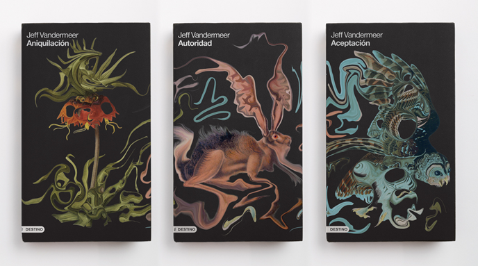
One of the great pleasures of seeing The Southern Reach Trilogy in print has been the ingenuity and sophistication of the foreign language editions. Among the absolute best of the many versions are Destino’s covers for the Spanish editions. Destino commissioned artist and designer Pablo Delcán to create these covers, which capture the surreal vibe of the novels as well as the theme of transformation running through the narrative.
I caught up with Delcán via email to ask him about how he created these striking images, and to share with readers some early versions. You can experience more of his amazing work at his website. Spanish readers can also check out the Destino Southern Reach webpage.
Jeff VanderMeer: The style you used for the Southern Reach novels is different than your other work for book covers. Can you tell me a little bit about how you came to do these covers, and why in this style?
 Pablo Delcán: The style I used for these covers was originally used for a Jules Verne series I did a few years ago, each one of these covers was created by abstracting naturalist illustrations. For Twenty Thousand Leagues Under the Sea, for example, I gathered images of different sea creatures and abstracted them into patterns.
It was about giving a twist to the natural and known world, a way of making it fictional and distorted. The style worked well for The Southern Reach Trilogy because the writing does something similar, it’s about bending the rules of what we know is possible to create something fictional, Area X, the border…
When Ferran Lopez and Sabrina Rinaldi, from the Editorial Planeta art department, reached out to me, they pointed repeatedly at this Verne series. We knew we would follow the idea of the plant, the rabbit and the owl from the FSG covers that Eric Nyquist illustrated.

Around that time I had been playing around abstracting objects and photographs of toys and angel figures in similar ways to see where else I could take this.
These covers were influenced by these experiments. Some of the earlier sketches for S.R. distorted the images to a point that it was very hard to discern what it was, I really liked those.

Is the constraint of having to focus on particular subject matter, like when you do book covers, useful to you sometimes in creating art, or…?
It’s an important part of the foundation; having a specific subject or a brief to follow makes this task objective and informs the process. Artists or writers talk about the fear of the blank page, for designers it is more often than not something already there.
Although I think striving for a balance of release from this constraint is just as important. It’s what makes what we do interesting and fun, it brings something new and unexpected to the work.
Is the S.R. cover art digital? What kinds of technique went into creating it?
 These covers were an exercise of appropriation, the most important part was finding these images. The plant comes from an illustration of a Fritillaria imperialis beautifully drawn by Pierre-Joseph Redouté in the early eighteen hundreds, the hare and the owl are Audubon engravings. Once these images were found and we liked the way they worked as a group I used a photoshop filter to create this effect, it’s simply a tool that pulls and mirrors the image. My role in this case was a bit destructive.
What was the most difficult part of creating the covers?
 |
The most difficult part was making them look like a series of independent but correlating covers, it had to be obvious at first sight that they all belonged together. There was a fair amount of tweaking to make sure each one was different enough from the others by adjusting the color, the amount of abstraction and the direction of the gesture.
Do you have any particular influences when it comes to art?
I do, I grew up in a house that was used as my grandmother’s ceramic studio and my mother’s art studio in Menorca. My father is a film-maker and animator, I’ve inevitably been very influenced by their their work. I’ve also had mentors that have influenced the way I work, Peter Mendelsund and Carin Goldberg, both brilliant designers.
Artists like William Kentridge, James Turrell, Luigi Serafini, Louise Bourgeois, and others have also been influential in some way or another. It’s hard to pinpoint these things, so much of our surroundings ends up finding its way into the work.
 |
What kind of fiction do you like to read? (And did you need to read or sample the S.R. books before you created the art?)
I honestly read very little, most of what I read are manuscripts for book covers. But I’m always excited to work on science-fiction covers and it hasn’t been often.
I did read the first one of the S.R. books before designing the covers and it did help. It always helps, the better you understand what you are doing and the more responsible you become of giving it the proper face.
I’m a huge fan of Nabokov, so I was thrilled to see you’d done a cover for a Nabokov book. How much freedom did you have on that project? What were you trying to convey?
This was the first commercial commission I ever got. I was so excited to be designing a book cover that I completely neglected the fact that it was for Nabokov. It was designed overnight and delivered first thing in the morning, it was approved immediately and I thought the world of book cover design was magical, which it is, but not to that extent.
 |
The idea for the cover was given to me by Peter Mendelsund who hired me to do this cover, he called me into his office sketched out a crown on a notepad and scribbled the title inside and that was it. I then made it with black paper and photographed it on a light table. The shattered crown is supposed to convey the idea of a monarchy overthrown.
What projects are you working on now?
Right now we are working on a rebranding for Imaginal Disc, a production company that promotes and explores the overlap of art and science in film. We’ve also been working on book covers for some non-fiction books, some sporadic spot illustrations for TheNew York Times, three-dimensional installations, wallpaper designs, sculptures and several animations. I’m trying to move the work we do at the studio into different mediums: furniture and pottery is something that we will be doing next.
Jeff VanderMeer is an award-winning novelist and editor. His fiction has been translated into twenty languages and has appeared in the Library of America’s American Fantastic Tales and multiple year’s-best anthologies. He grew up in the Fiji Islands and now lives in Tallahassee, Florida, with his wife.
RELATED STORIES